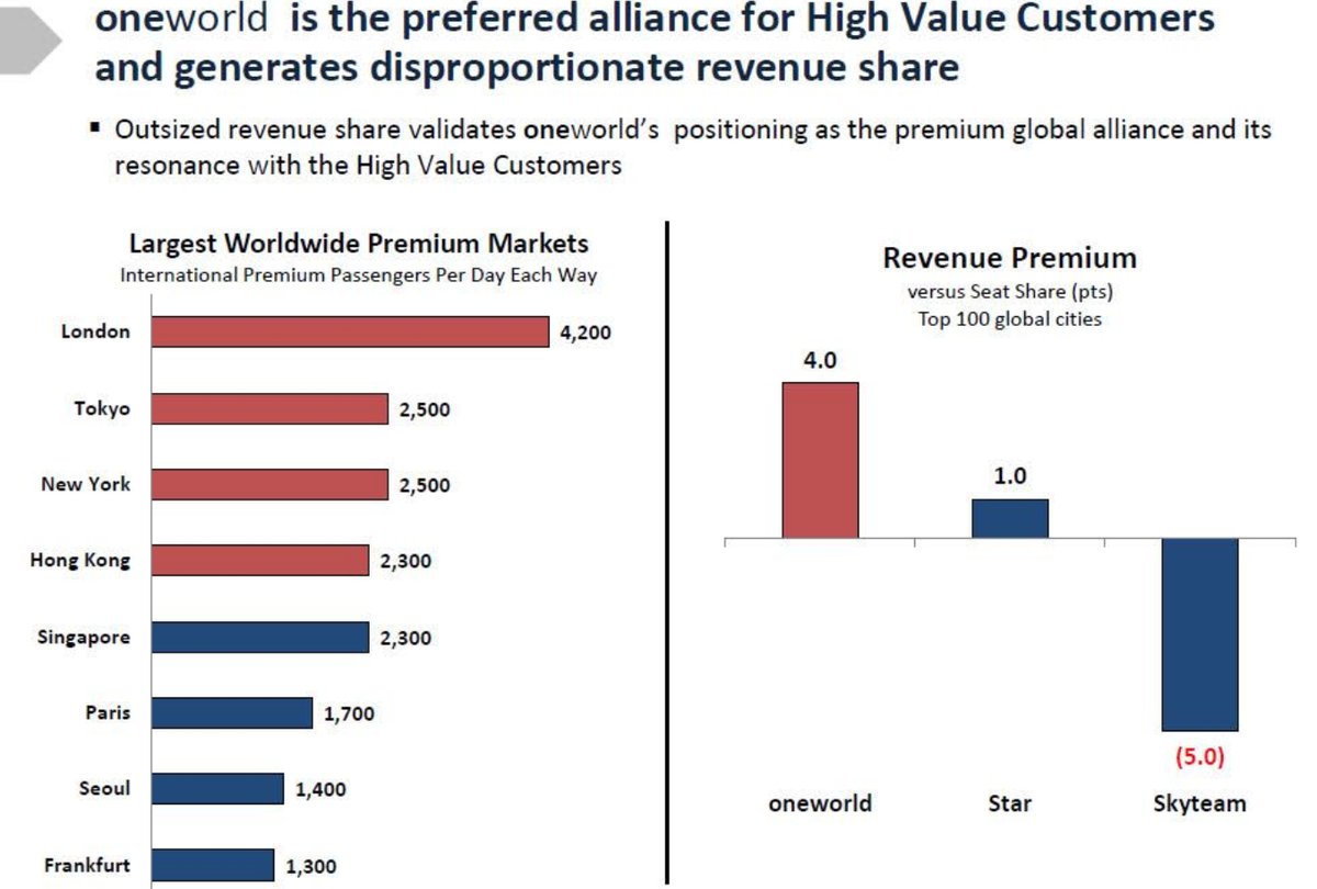
The sibylline Brian Sumers tweets a oneworld slide claiming that data supports the claim they’re the preferred alliance of customers who spend the most money.
When all it really says is that oneworld has a presence in high yield cities but since they’re smaller than Star Alliance they don’t have as big a presence in lower yield cities also.
The real takeaway from the data, though, are which cities have the biggest concentrations of premium cabin customers.
What are the largest premium airline markets in the world? A source shared this @travelOneWorld slide. I'm not surprised by any. Are you? pic.twitter.com/BAemTjb5mL
— Brian Sumers (@BrianSumers) October 26, 2017
This doesn’t show what they want it to show — that premium cabin customers prefer oneworld. It shows that airlines which are members of oneworld have London Heathrow (British Airways) locked up and the biggest presence in Hong Kong (Cathay Pacific) along with the second largest presence in Tokyo (Japan Airlines).

You might think that this means customers prefer British Airways and Japan Airlines (though you’d then concede they ‘prefer’ Star Alliance member ANA more). But it really means that British Airways has the bulk of Heathrow slots sewn up and airlines have only a limited ability to offer serious competition from Heathrow. Indeed even London Gatwick is capacity constrained. So if you want to compete for the London market you have to do it from airports Londoners don’t want to fly from.

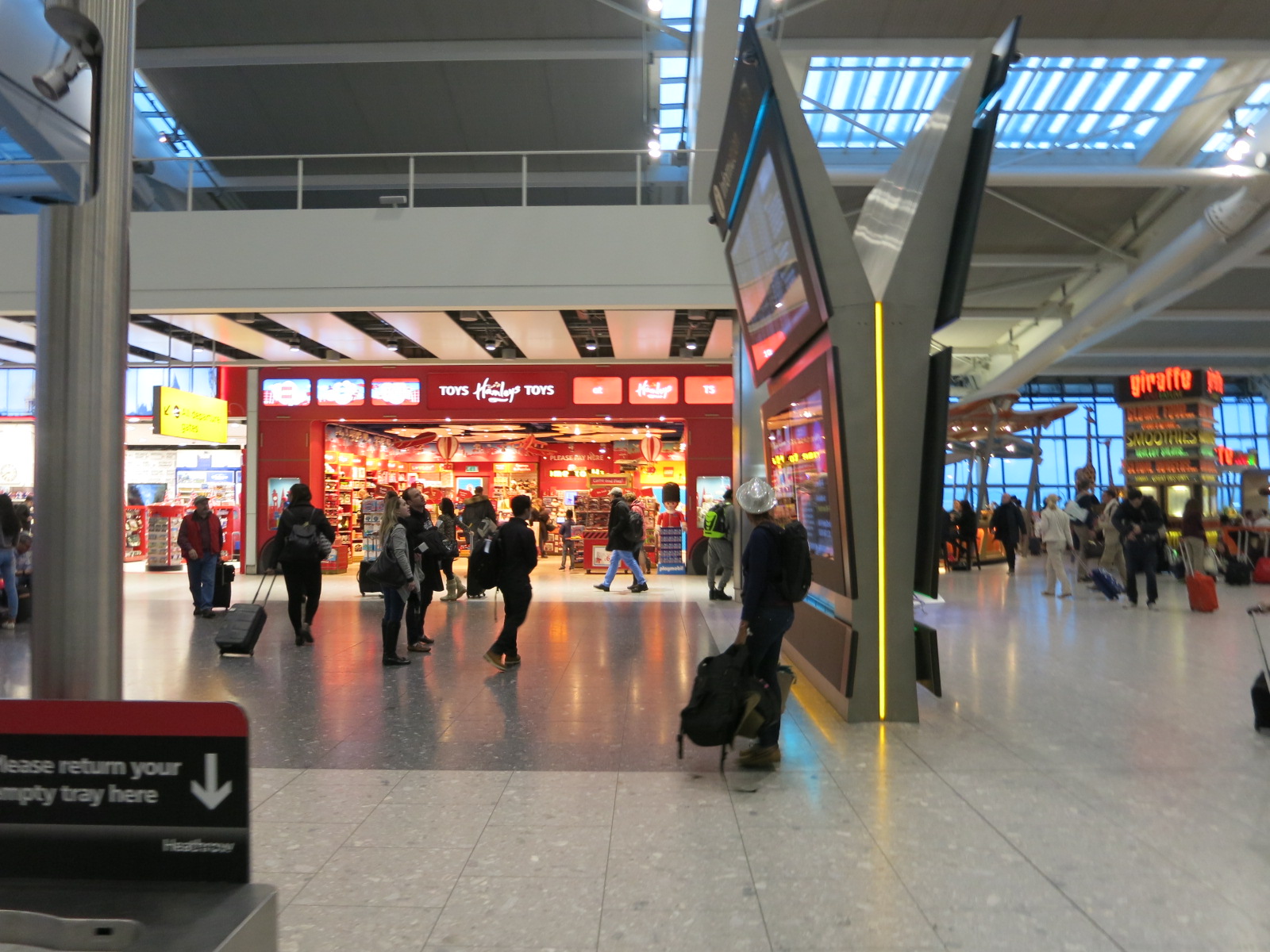
London Heathrow Terminal 5
The graphic would make it appear as though New York is a oneworld market, and while it’s not a non-oneworld market both SkyTeam (Delta) and Star (United) are bigger in New York than oneworld (American). In fact American now describes Philadelphia as its transatlantic gateway and says that they serve boutique business markets from New York.
That said there’s no market in the world like New York – London where the American Airlines-British Airways joint venture is largest and London – Hong Kong (BA/Cathay) and London – Tokyo (BA-JAL) are significant.
While oneworld is well-represented in four of the top eight premium hubs, Star is well-represented in four of the top eight premium hubs and SkyTeam only marginally behind being able to claim four since Virgin Atlantic is so much smaller than BA.
This graphic is largely about real estate, though, and not customer preference. Moreover because Star Alliance is so much larger they’re more represented in less premium markets which drags the revenue premium cited down. Having more airlines with more hubs doesn’t mean Star is less preferred, as oneworld would apparently like you to think.


Just wondering…is Brian Summers inscrutable in this particular tweet, or is he inscrutable in general?
LAX & SFO not in the list?
Star is in 5 out of 8 :
New York UA
Frankfurt LH
Tokyo NH
Seoul OZ
Singapore SQ
This chart is also stupid cuz oneworld is #3 in New York and #2 in Tokyo.
Oneworld is #1 in barely 2 out of 8.
Also, you can’t count VS inside Skyteam. They’re in JVs and multi-way ownership structuring but that doesn’t make them a de facto Skyteam member.
That slide is a goddamn beautiful disaster. Whichever PR knob came up with that mix of vague terminology, doublespeak, and spin has a bright future in politics.
First off, the left side says nothing about which cities are the most lucrative for airlines as Gary’s title implies. All it does is list the 8 cities with the highest number of “premium” (i.e. first and business class) passengers per day. Since these are basically the most important cities in the world (at least financially), it’s not surprising they would have a lot of premium traffic.
What the left side does not give is any information about oneworld’s share of either the passenger numbers or revenue in those markets. Instead, they highlight the fact that the top 4 cities are oneworld hubs, allowing us to infer (rightly or wrongly) that oneworld dominates the premium cabin traffic in the biggest markets.
The right side uses a completely different data set, the “Top 100 global cities” as measured by some non-specified criteria. It suggests that oneworld has greater revenue per seat than Star Alliance or Skyteam in these markets. They call this “Revenue Premium” but here are using a different definition of premium than on the left. Presumably there are many economy class passengers in London, Sydney, Hong Kong, etc. who pay extra to fly direct on their hometown (oneworld) carriers rather than connecting elsewhere. Is this revenue premium simply a function of oneworld’s better hubs?
Finally, the title at the top refers to “High Value Customers”, another vague and undefined phrase. Are they talking about first/business class passengers, economy class passengers willing to pay more for direct flights, frequent flyers, or something else?
By conflating premium seats with revenue premiums and tossing around a few nebulous terms, the slide implies that valuable first and business class passengers prefer oneworld and are willing to pay more to fly its airlines, when none of the data presented actually supports that.
Completely agree with Arcanum. This slide is extremely misleading. Designed to be so. It indicates no preference at all nor does it say anything about share. Nor does it define what revenue premium means. In essence, it looks important but it isn’t. Plus terrible glutamate undermines any point it’s trying to prove. A big nothing
Grammar, thatvshpuld ssy
Is this O&D traffic, or transiting Heathrow from throughout the world? I assume its the latter. People are fricking broke in England, everything costs double and they definitely don’t get paid double…. and the truly wealthy fly private