An American spokesperson emails,
I just wanted to give you a heads up that around 11 a.m. CT this morning, we’re refreshing the look and feel of our award charts to make them easier to read and navigate. There are NO changes to the content or pricing, etc.
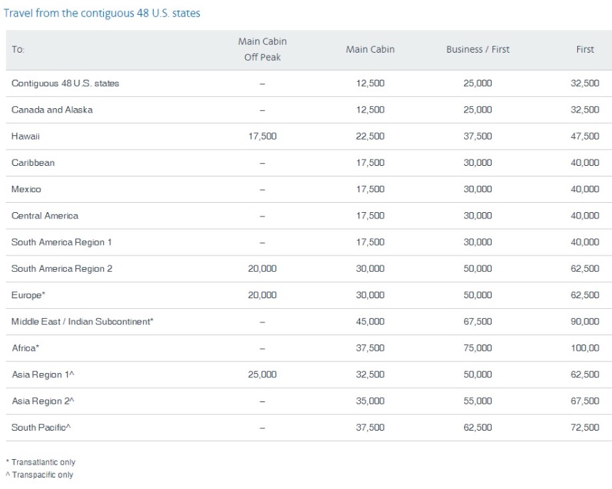
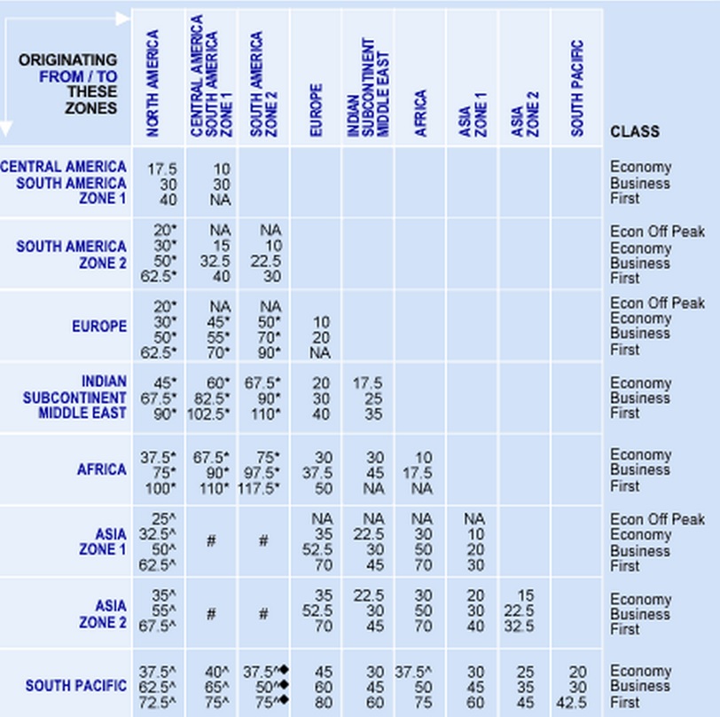
I don’t think the new award charts are easier, I actually think they’re more cumbersome, since you now get a different separate chart for each region of the world instead of a single grid.
Here’s the new partner award chart for travel between the US 48 states and the rest of the world.
Why are they doing this?
We are in the process of updating all of our aa.com pages to match our new look and feel, so award charts were next on the list. By adding drop down menus for each region, we think it’s easier to navigate and quickly find the award prices the customer wants.
They gave me a sample of a few charts in advance but they’ll all be up online shortly. I specifically asked about, for instance, the Hawaii chart — since it is now a separate chart — and have been assured that all of those prices are the same as before so the same as the rest of North America for the partner award chart.
I felt I had to ask, even though I was told no changes, because the new charts will be a lot to go through. Or, as the American spokesperson said, “since there are so many drop downs.”
For comparison purposes, here’s the current version of the partner and oneworld airline award chart:
I guess it doesn’t matter, since these are just the award charts that have changed look and feel and not the prices changing at all.
And American is going to the trouble to redesign their award charts for the web, as opposed to – you know – removing award charts entirely (cough). So kudos to them on that!
Still, I prefer the old charts myself. Which do you like better?


So you are telling us to trust an airline that does not claim to be “The World’s Most Trusted Airline?”
Hmmm…there might just be some logic to that…
I actually found the new charts to be readable (at least the one you posted, since they haven’t loaded the new ones yet). I’m indifferent between the two.
At least they had the decency and transparency to reach out to you and let you know. Totally the reverse of those idiots over at Delta.
So Kudo’s to them for that (and screw you Delta, over and over and…)
Probably no real change when programs merge. They take the AA chart as is. Bad news if you liked to game the US chart but that was known.
Thanks for posting the old charts. I’ll bookmark this page for future reference in case I do find the new charts more cumbersome.
I agree the advance notice was important. Otherwise when I pulled up the new charts, and saw they were different, I would have panicked that a devaluation had occurred.
I like the new charts. They are “cleaner” and easier to read. I always got confused reading the old charts. I guess it is what you are used to.
I would like American Airlines keep the old format and give you the option of selecting and displaying the new and the old format award chart. That should please everyone.
Thanks for posting an the image of the old chart. It printed nicely on a full readable page and is on my wall next to my travel bucket list!
Which do I prefer better?
I prefer the AAdvantage Member Guide Award chart from 2000. There, I could use code CX135A to fly from “North America to Asia 1, Asia 2, or Japan” with stopovers in North America and Hong Kong.
Not now. 🙁
So when AA devalues, it would be easier to do so with the new format, one change at a time will not upset too many people.