Via Milepoint the ‘beta’ version of United.com, in development for years and interminably delayed, is now live at beta.united.com. So you can go check out what they have in store, while the existing united.com site remains live.
The new website has a fresh, clean, and much more modern look than the old one.
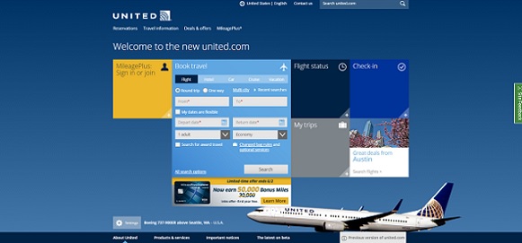
The old site, though (i.e. the Continental Airlines website) has worked pretty well for a long time. The new version, while slicker and more mobile friendly, seems just a little less functional and easy to get customized data from. Maybe it’s just me as the user that needs to get used to it.
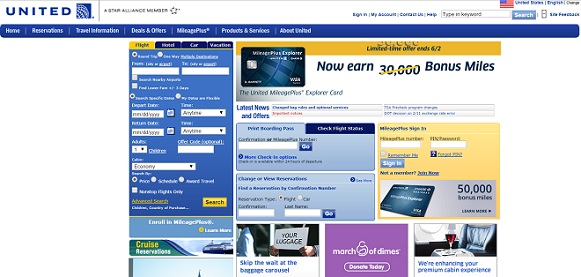
Frankly the Continental website was for the most part an upgrade for United — it brought partner award booking (united.com only supported Lufthansa and US Airways awards in addition to United awards previously), although it did come with a tendency to error out in the booking process and of course the inferior Shares back-end.
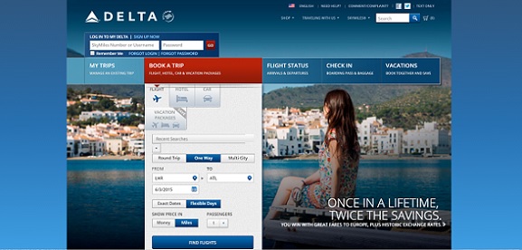
Aesthetically the new site looks quite a bit like Delta’s.
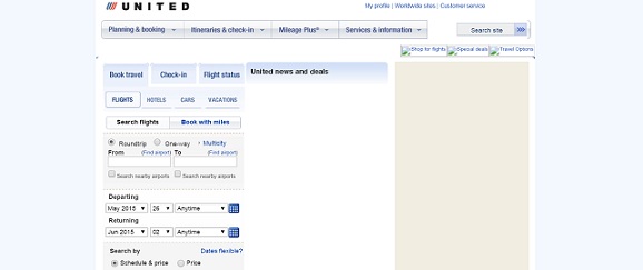
Unquestionably they’re all advances over United.com 15 years ago.
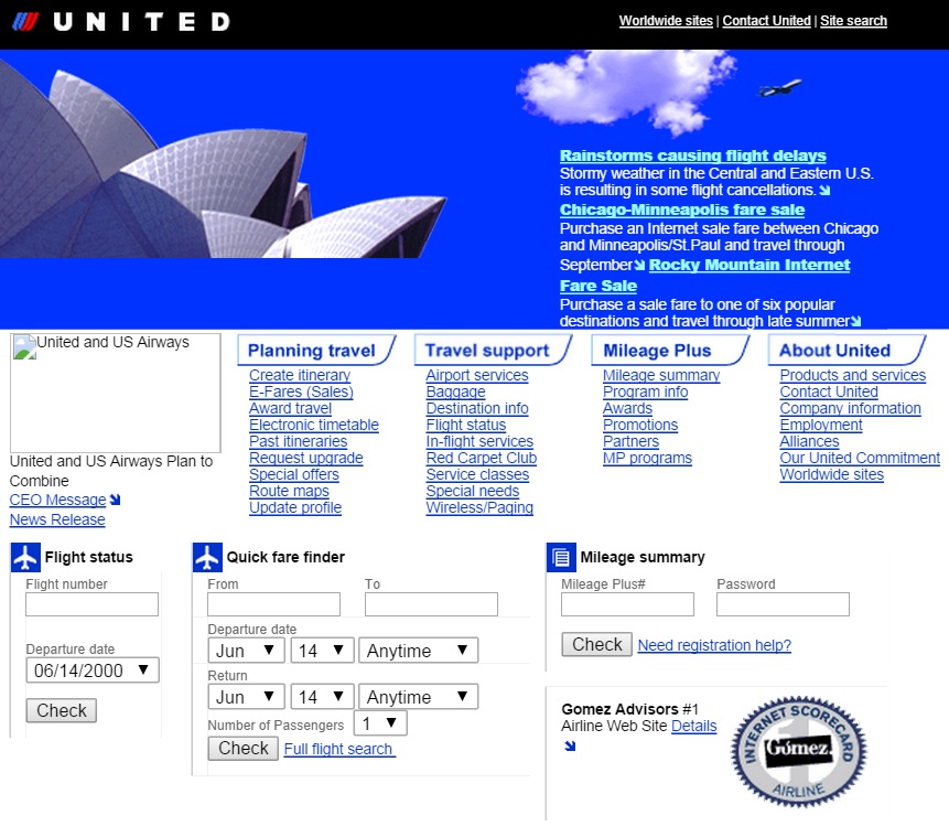
Though award and upgrade processing aside, much of the functionality seems about the same since the mid-2000s.
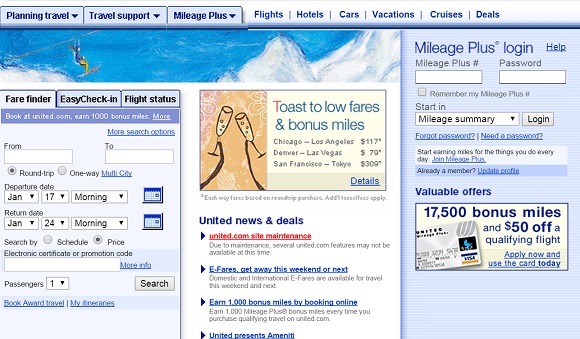
Go ahead, play with beta.united.com. What do you think?


United copying Delta? Impossible!
🙂
Very sleek. Same theme as the MyStatus website.
But fares are shown each-way, a la WN!!! I hate that format since it’s so misleading (e.g. the RT isn’t twice the outbound leg and you have to click thru to figure out how much it actually is!). Much rather have a/i pricing. But I use Matrix exclusively so it doesn’t affect me 🙂
As an AVgeek I like that there is a link to the United shop from the home page. Otherwise it’s just a matter of getting used to the new format.
Noticed some bugs as my reservation from Osaka says it’s from Rome, and when I searched airfares from the calendar grid the return date defaulted to today and an error message popped up saying that I couldn’t return before my departure date.
award availability shown for partners doesnt match up with the old site… at least for me
@mike — ditto here.
I’m seeing neither Avianca/Taca nor Copa space, even though it’s showing on united.com. Interestingly, the calendar is indicating the partner space available (a blue hue on the date in question), it just isn’t listing those partners in the results. Hopefully this is a glitch soon fixed, and not a “feature” of the new United.com.
Personally, I hate having to click through paginated results. I wish they’d let me display them all, especially by default. This isn’t the 00’s, and I have to scroll up and down to get through your 20 results anyway, so why hide the rest of the results?
Well, upon further investigation, it’s a bit like the Who song, meet the new boss, same as the old boss. 🙂
It’s the same basic behavior as united.com, but I’m seeing the behavior on different routes with beta.united.com. Searching ORD-SCL, for example, shows partner space on Copa.
Oh, hey, there’s a “show mileage earnings in search results” option on the advanced search!
They’ve dealt themselves out of the game my giving coach flyers only half the miles flown now. AA trumps.
I’ve been playing around with the beta site for months. IMO, it is a complete failure — if one wants a site to actually do business.
when will the ‘buy gift cards with miles’ be up and running… it keeps telling me only a select few can use it?????