American has had a new lounge palette that’s been slowly rolling out
The Buenos Aires club is stunningly modern (though not big enough for the volume of passengers at peak times).


The Paris lounge is in the new design.


American has boosted their lounge food (along with United and Delta).
Alan H. sent me this Bloomberg piece about airlines making ramped up investments in their lounges.
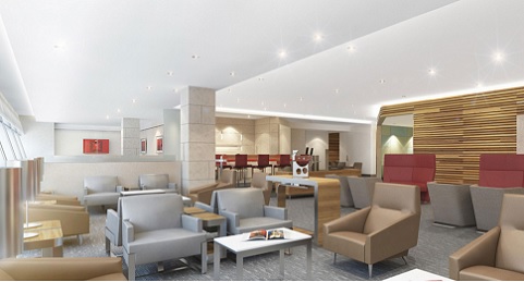
The thing that struck me is that it included a photo tagged “Design for American Airlines’ new lounges” from James Park Associates. And it’s one I hadn’t seen before:

It’s not wholly inconsistent with the new design palette that American has been using but it still appears to be a departure from that. Note especially the lighting and wood walls.
Ultimately it’s the people that make the lounge, but it’s great to see the investment.

Here’s how to get American lounge access for $200 a year… instead of $450.


I’m glad to see that American is moving away from the Trump-tastic “80’s boardroom” style of lounges. Hopefully their upcoming renovations will adopt these chic and relaxing designs.
Seems similar to the G concourse lounge at O’Hare.
These designs have no staying power and will look aged and tired well before stingy AA will update them. Wish they chose something less trendy, since I doubt AA will turn itself in the quality carrier it would take to keep them fresh.
It IS about the people – and I know the one in your last photo, he saved my digital life when he lent me a phone charger when mine stopped working last week at DCA!
That’s Jonay, one of the bartenders at the DCA club.
I don’t know why the EZE AC is so crowded, when the LAN lounge right next door is lovely and empty. No-brainer to use that one instead (for status pax and those traveling J/F).
@Anon and he’s awesome! (Johne is his name actually)