There are all sorts of ‘free ticket scams’ out there and odds on if you’re reading a travel blog you’re savvy enough to realize what Snopes has created a page for — that airlines aren’t giving away free tickets if you like their page.
To be sure airlines used to give away frequent flyer miles for liking them on Facebook. They thought they could build up an audience that they could market to forever, not realizing that you don’t make money on someone else’s platform — that soon enough Facebook would start charging a toll for companies to reach their followers.
But there hasn’t ever been a free ticket just for liking a page, or forwarding a scam email to 50 friends either.
However there’s a new variant on this scam that is really clever. Smart people look at the domain name of a website before believing they’re really dealing with United Airlines or Delta or Southwest.
But what if the scammer actually made it look like the scam website was Delta’s? I don’t just mean copying Delta’s branding. What if the URL they directed you to was Delta.com?
That’s precisely what the latest generation of this scam does. Their websites are deǀta.com, easyjėt, and ryanaiṛ.com. Don’t those look almost just like the website addresses you’re used to seeing? You might not even notice that a pipe (|) replaces the L in Delta or that there’s a dot above the second e in easyjet.
These websites are mobile-optimized (they render funny for desktop broswers) and are set up to look like a page from the airline, and “they all include a Facebook-like section where it is made to appear as though a number of users have liked or loved the “post” along with a handful of positive comments.”
Here are two samples:
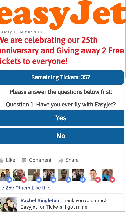
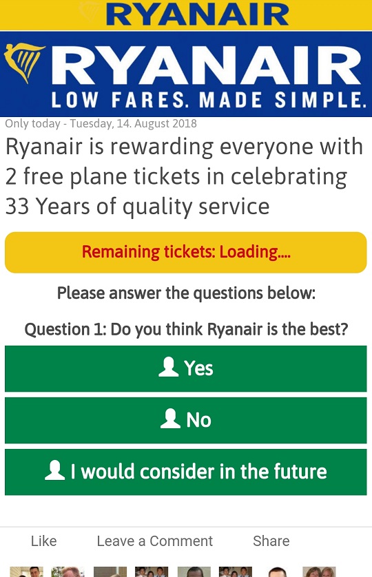
No one offers a free airline ticket for answering three questions and sharing the (scam) offer with friends.
Anyone offering something for free but asking you for a credit card to claim your prize is suspect. However scammers are getting good at making themselves look like the brands you know and maybe even trust (I don’t think I’d have chosen Delta, Ryanair, or easyJet for that myself).
Let’s all be careful out there!
(HT: David H.)



The spelling mistakes should be a dead giveaway that this is not legit.
@Skaner,
Agree 100% spelling mistakes should be a dead giveaway it’s not legit!
However, the minor imperfections such as an extra dot, that easily can be mistaken for dirt/debris/scratch/cracks in glass (etc.) on one’s screen instead of a ”tell” for a defect indicating a scam is not always readily apparent, especially to anyone who’s vision, be it from garden variety genetic outcomes at any age in life, young or old, isn’t a perfect 20/20 – or especially for those over 40 years old, whose eyes commonly begin to experience problems with reading small text (as in under 12 pts.) in general (for example, small fonts in print or menus in restaurants [more so in dim lighting], etc.), but even more so on mobile devices where the screen size further reduces the size of much text (especially in the URL address field where enlarged text features may not include that part of the web page).
Also, and as Gary notes, even for those with perfect 20/20 vision, the substitution of a pipe symbol, “|”, for the lower case “l” in delta.com is not going to be readily apparent at all.
For example, from the sample of nine shown below, how easy is it to QUICKLY (all caps used for added emphasis, not “screaming” or shouting) spot the difference between the correct version using the lower case “l” versus the fraudulent version with the pipe “|” replacing the “l”?
1.) delta.com
2.) delta.com
3.) de|ta.com
4.) delta.com
5.) delta.com
6.) delta.com
7.) de|ta.com
8.) de|ta.com
9.) delta.com
Sure, some may be computer/device savvy (or even proficient coders who’s eyes are experienced enough to detect readily) to spot the difference immediately, and some may also be exceptionally gifted to see the difference quick enough to know something’s NOT “kosher” about the URL, but a great many will not be able to detect the jenky pipe symbol for the proper lower case “l” that our brains are already so conditioned to see, or which may yet also be distorted by the type of font used on ones’ device, that even if the pipe symbol stands out upon closer inspection, our brains still “see” as de|ta.com – even if it isn’t delta.com!
Especially when the rest of the image features much larger fonts and/or other intentional “distractions” such as bright colors or a “survey”, all of which is very much intended to shift attention towards the center and bottom of the screen and away from the ever so slightly “fudged” URL that the scammers use to perpetrate their frauds.
Some have noted that scammers often make intentional grammar and spelling errors, in order to avoid dealing with the perceptive folks who notice them. Put another way, they want to reach only the less knowledgeable folks.
In this case, the fakes are so good that I believe they could do away with that filter.
We need a “help I’ve fallen and I can’t get up” alert system for my elderly mom and aunts who constantly fall for this.