Delta Air Lines is planning new flight attendant and ground services uniforms, which should be revealed in the coming days. Pilots will eventually receive a new uniform as well. Some of the concepts have already leaked that we’ll begin to see inflight.
Overall I think these are fine? They’re probably more distinctive than what we see from other U.S. airlines. And I’m not a big fan of the current ‘Passport Purple’ at least compared to the ‘red dress’ that came before it.

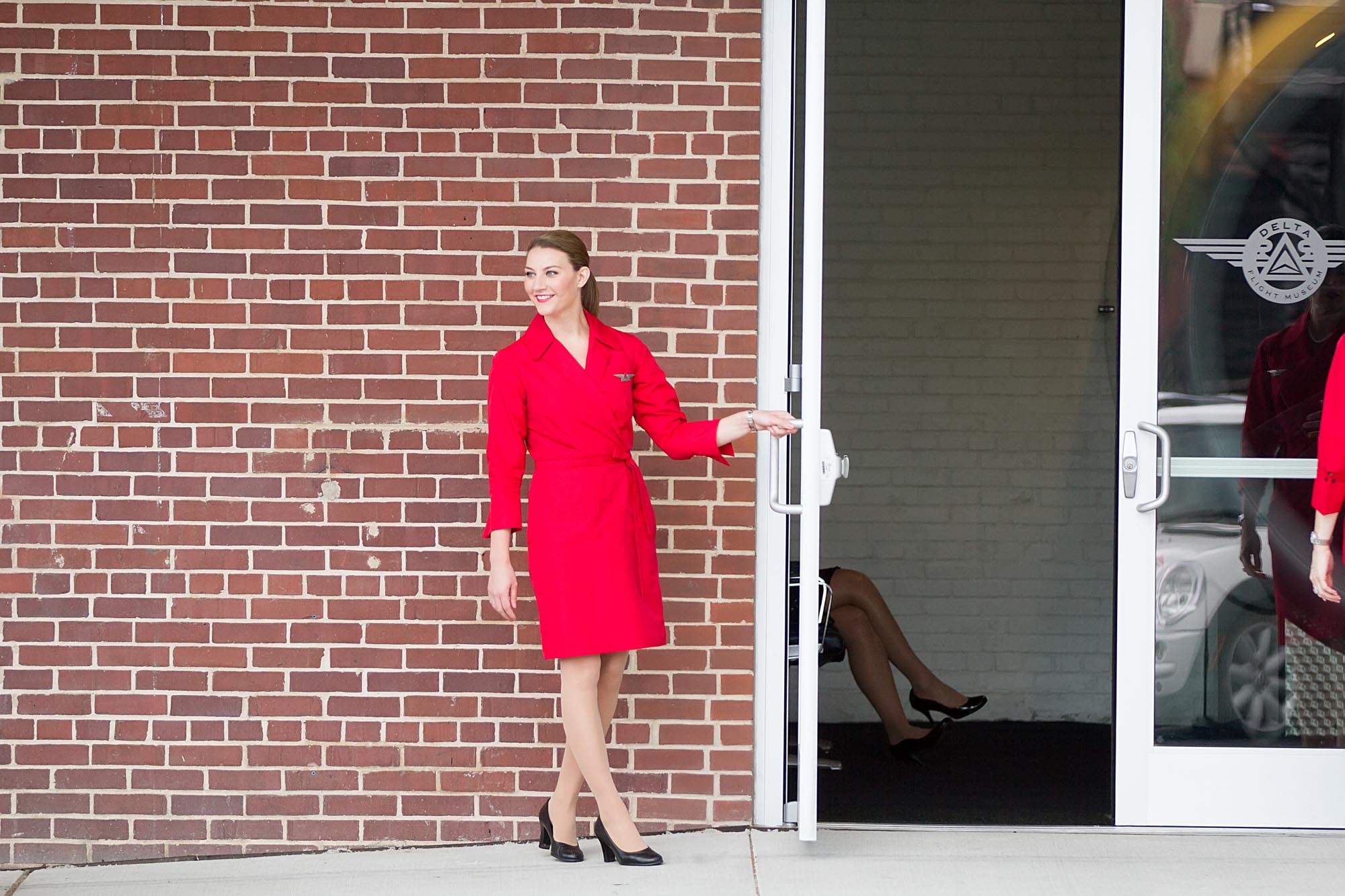
Hopefully they’ll get the fabrics for these uniforms right. Other airlines have faced significant complaints over allergic reactions.
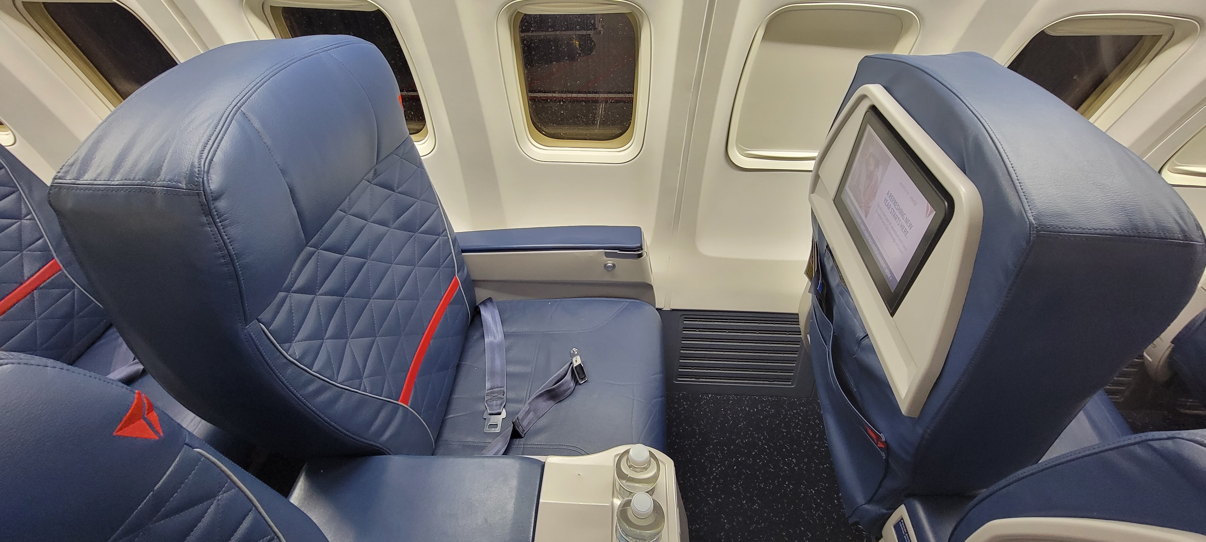
This is part of an overall brand update. Delta is planning to refresh their cabin interior palette, moving from bright blue to more of a dark blue and grey. These cabins could appear as soon as their Airbus A350-900 deliveries slated for end of the year, or for their Airbus A321neos next spring. Eventually many existing aircraft should see a refresh as well, though the first one is likely a year away.
The biggest question, I think, is whether new uniforms and new cabin interiors will be accompanied by a new aircraft livery. One has been rumored for some time.
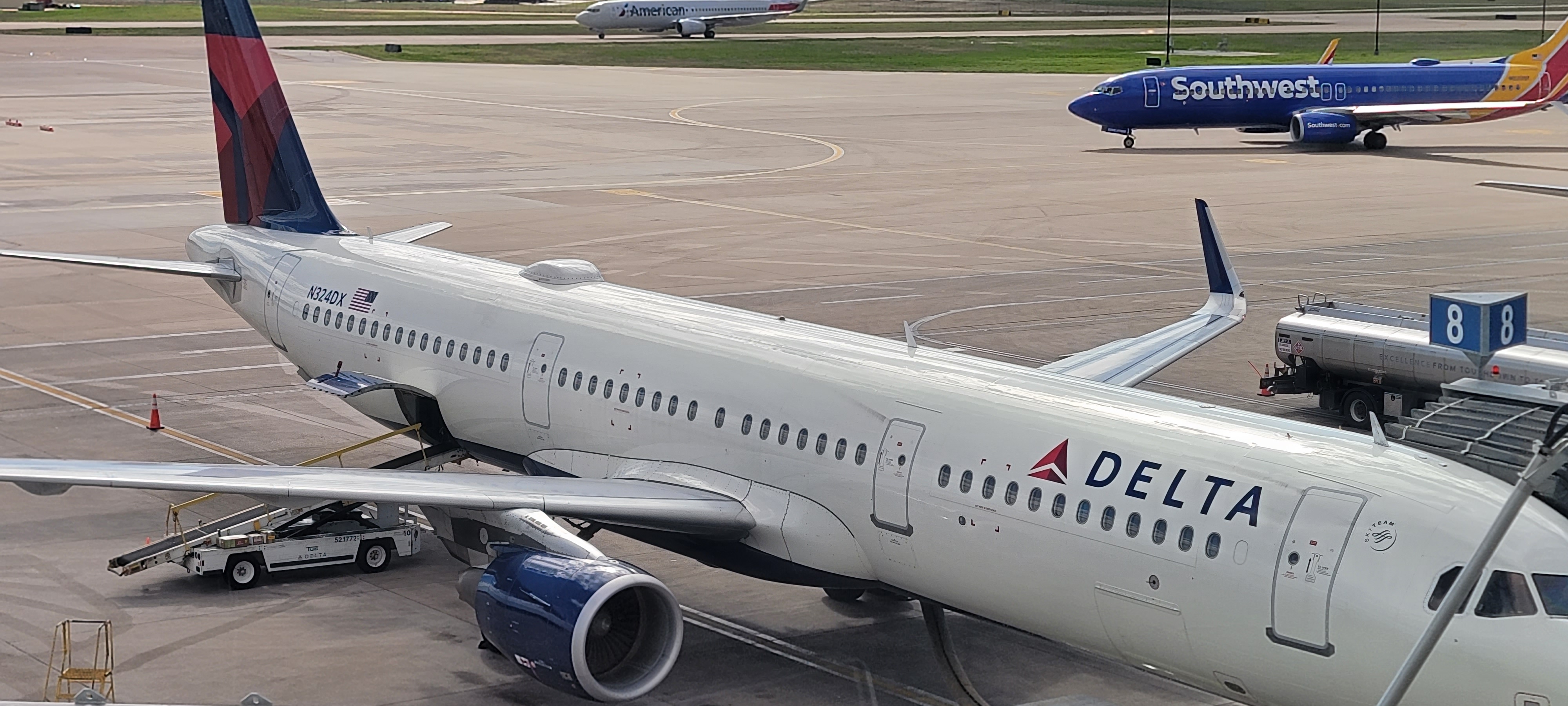
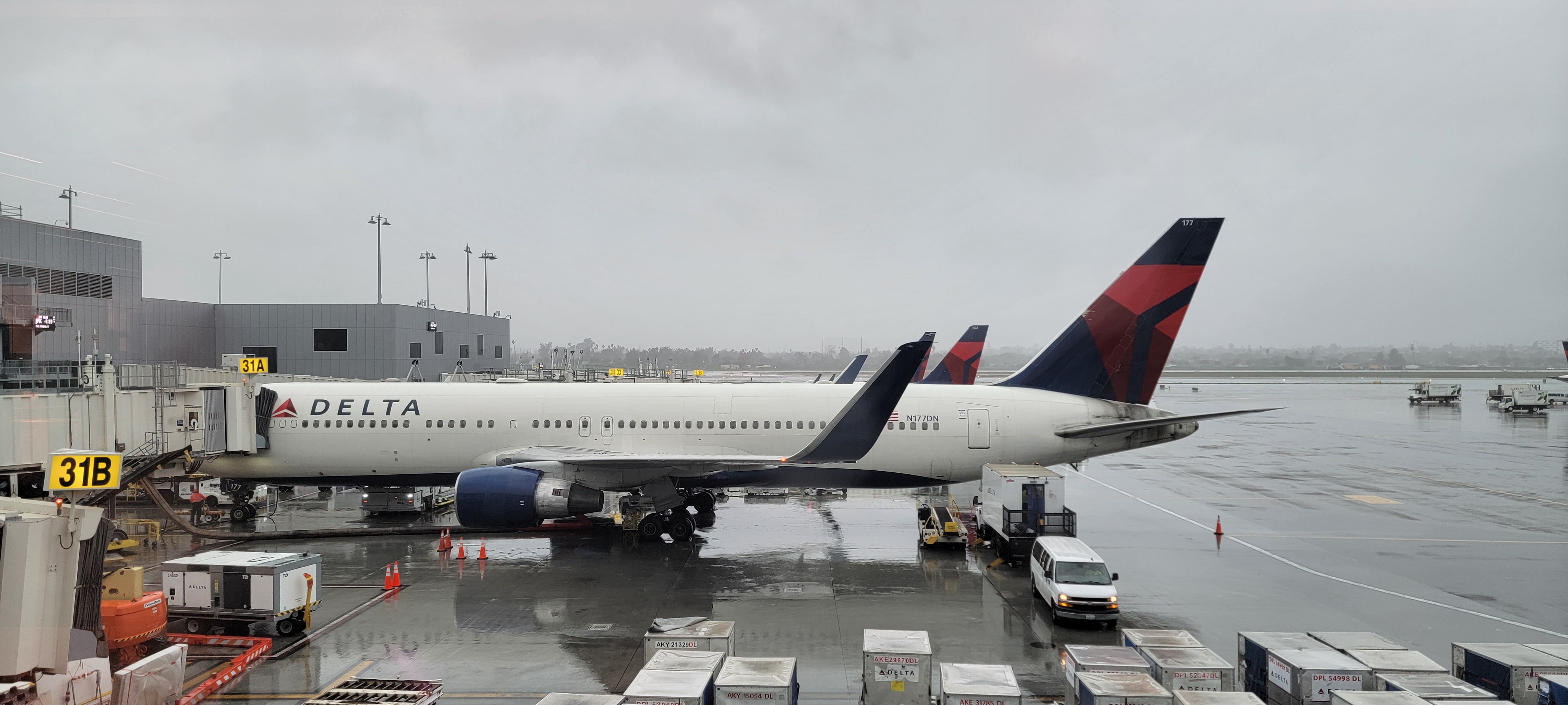
There’s even been speculation that the ’tilted widget’ could be out, though I’d be genuinely surprised and disappointed. It carries a legacy and connection back to 1959 and the dawn of the jet age. It represents delta in the greek alphabet and a ‘swept wing appearance of a jet flying overhead’.

Some uniforms require a good figure. Singapore Airlines’ female uniform is one of those. EVA Air’s female uniform doesn’t require that good a figure except having fat arms is unattractive in that uniform.
Lufthansa’s navy blue is good for slightly chubby people.
I wouldn’t mind if they wore green military jumpsuits, like the New Zealand air force on flights to Antarctica.
Hmmm, Dark blue and gray. . .isn’t that AA’s color scheme. . .DL Now Following. And the new ones are worse then the purple ones. Personally, BA still has the best for the average person.
Red would be an improvement
They should have taken cabin cues from Virgin Atlantic – they have a nice mix of fabrics and pleather with warm use of color that feels premium not a sea of blue.
And here we going with thousands of complaints and them itching and causing all kinds of health problems lol
Not sure why but the leaked color palette and styling details remind me of something from the “Hunger Games” movies. Maybe its some sort of mix between the avant garde, militarish inspired accents.
No trousers for women from th e looks of it!
This is like the THIRD “new” uniform for Delta going back to 2018 or so. They just gave Sky Club staff new uniforms last falls. Navy blue security guard-esque polyester blazers. Frankly, it doesn’t matter what chic design they choose because they will still allow flight attendants to wear ugly-looking sweaters and trousers.
The uniforms are ugly, and they’ve changed them, what 3 times since 2018? Good use of all that profit they are raking in, for sure.
Such a waste of money. Put that $$ into better food, cleaner cabins, promptly fixed defective seat backs, etc. US domestic inflight service, especially in premium spaces, is generally subpar compared to the few international airlines I have flown. Upgrade service with more training, that training to be paid time for the FAs. I do praise DL for beginning FA pay as soon as boarding starts unlike many US airlines that pay FAs only after door is closed and the plane is ready to leave the gate.
I might be the only person who loves the current Passport Plum color.
The Plum with grey is very striking.
I like it far better than this super bright red.
Plum was a way of melding the blue and red into a unified color
They might re-design the Delta, but won’t scrap it.
I’ve always loved when the Delta widget faces Northwest on the tail of the plane!
(not sure if that we unintentional)
This from The Addams Family?
“I’ve always loved when the Delta widget faces Northwest on the tail of the plane! (not sure if that we unintentional)”
I’ve always wondered this too… it would make sense except that it points NW on one side of the tail and NE on the other side so I wondered… It’s symmetrical that way but I still wondered.
Cool thing if it was though…
More industry leading changes coming from the world’s premier air carrier.
So many fashion experts weighing in here. Let’s leave the design to the experts. I’m confident their selections will not impact you receiving your Diet Coke.
@ GAry — These are very premium looking! In fact, they are so premium, Delta will be raising award prices to compensate for passengers’ improved experience.
I believe the “compass” in the logo pointing Northwest was deliberate. From what I understand NWA was the stronger partner in the merger- it was not Delta “buying” NWA. A true merger of equal partners.
From what I read on Airliners.net, these are just prototypes. From what I have read, the tilted widget is going away.
LMAO
Haven’t seen a DL female FA that thin in a LONG time. Shoukd have shown how its really going yo look on their porky, dowdy female FAs
Surely the itching and skin rashes will require a premium level ointment.
Looks like Ed Sheeran on Star Trek
Will they still retain their traditional rudeness and total disregard for anyone under the status of Diamond Medallion?
My popcorn is running out. Where’s Premier Tim on this subject?
Due to a system error I am unable to spew a statistic laden, condescending auto response. Please try again later.
so glad to know you are missing me but I really don’t care what color any airline uses to paint its planes or dress its people – I don’t have to wear it so don’t care.
The number of people making comments here that involve judgments about “good figures,” “porky,” “dowdy,” etc is really disappointing. Is that really how you judge people? Wake up!
Looks like something out an old DeVo music video on MTV…..”when a problem comes along
You must whip it…”
For Patti, who complained about FA’s who are to porky and dowdy …really??? I like the Plum and the cut of the V-neck dress. It is flattering on most of us and I’ve received many compliments from passengers and other airline crews. Fortunately I didn’t develop an allergic reaction. I also liked our old uniform, especially the red dress. It was comfortable and flattering, even if you had to use a shoe paddle to get in and out. The blue dress was a nice alternative and flattered every size. I would like to point out to the gentleman complaining about FA’s in sweaters and pants that it gets really cold in our galleys and around the doors. I’d like a warming sweater option in our next uniform again but I’d like it to be flattering as well, not like the current monstrosity. I also hope the widget stays and also that Delta invests more in cabin comfort, practicality and upkeep instead of exterior paint changes.
Would much prefer the company invested these resources into getting our operational reliability back to where it once was.
@Patti
With your nasty comments all the time, I can guarantee you’re a fat cow.
@Karen, As one Delta employee said at the time, “Delta bought Northwest with Northwest’s money”.
And the widget pointing NW was intentional.
Having flown DL RT to Europe last fall in Premium Select, or what used to be known as Business Class, what DL needs to do is improve their level of in-flight service for those paying the extra above coach. They advertise a fine dining meal served on “premium flatware” we were had ours served on something called “eco-friendly paper”-which is nothing but a fancy word for cardboard. Also we didn’t even get offered a beverage service before the meal was hauled out, on a nearly 12 hour flight. The snack offered about an hour before landing was some sort of burrito wrap that was inedible-Taco Bell would be ashamed to offer it. The in-flight service and dining was poor in comparison to Austrian Air who we flew the previous year.
As for the DL livery design-bring back the classic widget and design of the 60’s-mid-90’s! Maybe because I’m an old DL employee, but I think they were the best looking livery in the sky.
Does anyone not realize these are fake and AI generated?
HORRIBLE!!! WHY can’t they go back to the chic, stylish, elegant, yet also traditional Richard Tyler uniforms of navy, white and red??? Those uniforms were the best in the industry!
Patch pockets on the hips? Probably not flattering to most women. Colors shown are drab. Uniform checks again would be a step in the right direction. As a former Delta stewardess, later flight attendant, the appearance of many today is embarrassing and sad.
The widget direction has nothing to do with the merger with NW. The all red widget was launched before the merger. Also, if you look at the branding at the ticket counters and gates the widget faces northeast.
I don’t like these uniforms are horrible for hot weather. I’m disappointed they didn’t think of us
https://www.yesterdaysairlines.com/delta-air-lines-liveries.html
-PRESENT: ONWARD & UPWARD / 3D RED WIDGET
Picture
Delta’s current scheme was inaugurated on April 30, 2007 when the airline emerged from bankruptcy protection. It was designed by Lippincott Mercer. The new livery was substantially simpler than the previous as it only consists of four colours. It also cleverly honours the history of Northwest Airlines.
In May 2015, Delta added its name in white to the blue belly of its planes.
The widget faces NW on the left side of the aircraft and NE on the right. We were told that is to symbolize “moving forward”. The NWA logos did the same.
The merger may not have happened when the logos were changed but it was in the works…..we had heard rumors for over a year.
I can’t speak to the logos at the gates.
Why is everything in the future so ugly, soulless and depressing?