American Airlines released new uniforms in fall 2016 and almost immediately started getting complaints from flight attendants. While they were coming from a small percentage of crew members overall, those reports included difficulty breathing and skin reactions. There were hundreds of reports of reactions even from crew members just being around others wearing the new uniform.
The design was workmanlike rather than stylish, but what drove American to make a change was the flight attendant reactions. Twin Hill, a Men’s Warehouse company, had manufactured Alaska Airlines uniforms with similar complaints.
It hasn’t been possible to really demonstrate conclusively through science a connection between the uniforms and the reactions, but that could be a limitation of the testing and the uniforms became such a focal point of employee angst that a company whose business strategy is focused on making employees happy again needed to make a change.
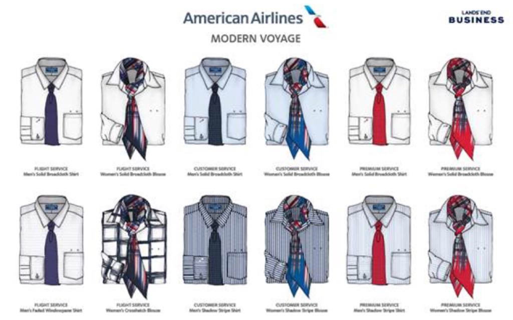
Here are the new uniforms:
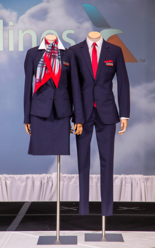
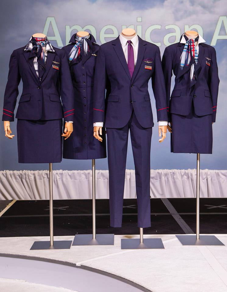
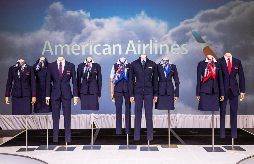
These new uniforms will be rolled out in 2020, updating the current 2016 design with Land’s End as the new manufacturer. Delta says their new uniforms are “Passport Purple” whatever that is, these are reportedly “Parisian Blue.”
Here’s details on ties and scarf pieces for various work groups:
And here are the uniforms worn live:
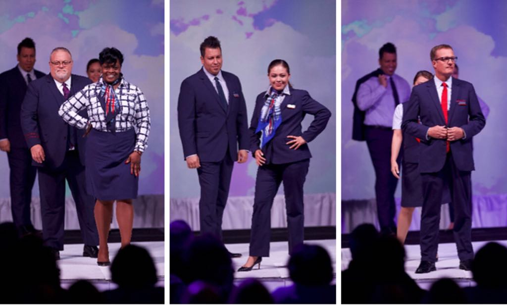
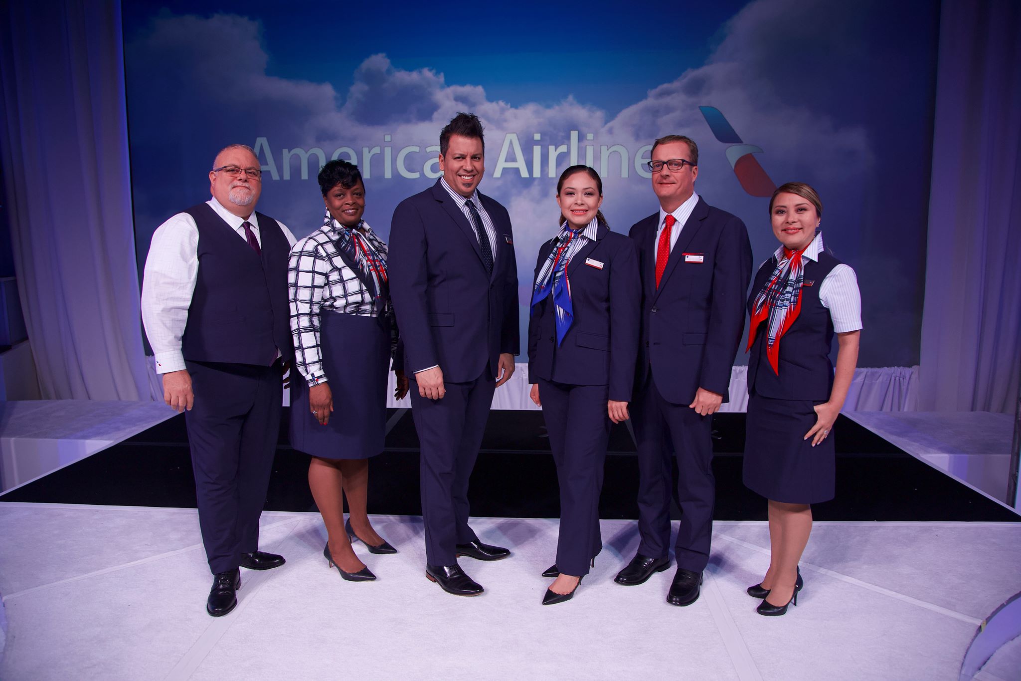
As a tweak on the current design I don’t find them particularly striking or a brand highlight. Everyone has to wear clothes though and hopefully these clothes will garner acceptance from American’s crews.

Waiting for a flight to LHR recently at BOS, an Emirates A380 crew came “marching” through. Having never flown on Emirates, I’d only seen their crews on TV commercials. Can’t tell you how much of an impression they made because of their beautiful uniforms and just from the fact that they all came through together in a totally professional manner.
US domestic airlines could really learn something.
How incredibly boring and uninspired. US leadership strikes again.
Nice that the included plus size models. However, I think it would be better if that had restrictions on weight gain.
Geez those uniforms look terrible. Horrible primary color scheme, clashy, distracting patterns. AA will soon stand for Awful Asymmetry.
Obviously, the uniforms were engineered to a lowball price.
Maybe 10% off AA flight attendants can fit in the uniforms of top 3 pictures, LOL. Rest of them……
Delta’s color is “Passport Plum.”
At least Delta is thinking out of the box with their uniforms.
For what it’s worth, the apparel company brands itself as Lands’ End. At least they don’t get it wrong with less and fewer, lie-flat and lay-flat or to and too as do half the travel bloggers out there.
Why do most US airlines choose to have such frumpy looking people with no modeling experience whatsoever to “model” their new uniforms? It makes the uniforms look worse than they already are. Alaska did the same thing recently when they launched their new uniforms during their own make-shift “fashion show”, which actually looked more like a bunch of ass clowns showing off to their friends at a honky tonk hoedown.
The uniforms look even worse w/ fat old ugly models wearing them.
They’re probably real life FAs.
Should have just left them on faceless mannequins.
Emirates is the Pan Am of the 21st century and we know how that story ended. These are a market improvement over the current “soviet union looking” uniforms. At least they are mostly blue and red. Those purple uniforms at Delta make no sense and clash with the cabins interiors.
BTW. . .people come in all shapes and sizes, inside is what’s important. RESPECT these individuals, I don’t see your picture on here for us to comment on.
Free work clothes. Thats how I look at it.
On my time off I wear whatever I feel good in!
Personal attacks on the models are rude, hurtful and at completely out ….AA is damned if they do and damned if they don’t regarding what body-type model they use….
As always crews will make this work…beautiful inside and out;)
OMG. AMERICAN BORING AND UGLY. ITS AS IF THEY WANT THE FLIGHT ATTENDANTS TO BE THE OPPOSITE OF ELEGANT AND STYLISH.
I’ve been applying for jobs here and I wanted to know what their uniforms looked like. I love this look, it’s clean, fresh and professional. To me it represents the company very well.
Damn, they are horrible hahaha
It looks like they went back in time, not forward.
Ugly, old type of uniform colors, way too basic and simple.
Those red ties and the scarves, dear Lord, horrendous.
They could take some inspirations from the new United Airlines and Delta’s uniform, even Emirates and Etihad.
Its so nice to see an airline returning the classic, elegant look of the golden age of flight. These uniforms are polished and professional and using every body type to showcase them shows that they are a uniform of function as well as form.
I would be proud to wear this if/when I receive my CJO
Awful.
I don’t choose my airline by flight attendant uniform attractiveness and I don’t know anybody who does. I guess if the employees like them that’s the most important thing.
The AA uniform color is not “Parisian Blue” but “Aviation Blue”.
I’m not going to comment on these useless and insensitive comments about how the new uniform and the REAL people that wear the uniform look like.
And as someone else said: post a picture of yourself so we can also comment about your appearance.
As long as they don’t make anyone sick like the other ones! And by the way, it was thousands who had terrible reactions, and now suffer long lasting illness of an auto-immune nature, not just a few. Many were forced to quit, due to the severity of their reactions and the synergistic effect of the combined chemicals covering the uniform material.