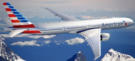
American unveiled their new logo and aircraft paint scheme today.


It’s been much-anticipated. There’s little question that:
- American’s current brand identity has been in place for decades, so it’s not unreasonable to look to a refresh
- As you conclude a bankruptcy process, a new brand identity can help generate the feeling of new beginnings and forward momentum
And American has been shopping around the idea that it’s not just desirable but also necessary to update the silver bird, the unpainted bare metal planes, because they’ll be bringing the Boeing 787 into their fleet. That new aircraft is made of composite materials that call for painting, you don’t just get the shiny metal look from unpainted aircraft.
Still it’s been curious timing — they are concluding merger discussions with US Airways, and if a combination of the two airlines materializes one might expect that the new folks in charge would get their own say in the look and feel of the airline, and that any new brand might be intended to meld together two airlines and two cultures and so potentially include elements of US Airways’ identity as well.
I’m not ‘first to market’ with the information, American released the logo and livery at 10am Eastern this morning. But I thought I’d take a couple of hours to get a bit more information than just the pictures, and also to wait to see what I actually thought about the artwork.
It started off with a call with Rob Friedman, American’s Vice President of Marketing (who used to run AAdvantage). He’s repeating the line that everyone at American is taking currently, that they simultaneously have decisions to make about their future but also need to modernize at the same time. And they repeat all of the changes they’ve put in process over the past year — to business class hard and soft product, aircraft orders, wifi, etc.
Rob ties the timing of the new logo and aircraft livery to the 777-300ER’s impending launch into service. But they just have a couple of those and could have painted them in the classic scheme, their composite 787s don’t enter the fleet until 2014 (which right now I bet they are glad of!). Rob notes that the Airbus aircraft begin rolling in in July, and those have composite elements that need painting. I wasn’t aware of that. But still, they could have pushed an announcement forward a few months.
Terry Maxon thinks the new branding incorporates elements of the US Airways design already.
The timeline to refresh the existing fleet is 3-5 years. Right away we’ll see changes at aa.com, to the mobile app, and branding in the social space and with their airport kiosks. The plan is to paint the roughly 60 new planes a year with the new scheme, and repainting of the existing fleet won’t be done nearly as quickly as we saw with United post-merger with Continental.
We will, though, be learning about additional elements of the brand identity soon — they expect an announcement on new uniforms next week.
They’re looking at a long-ish rollout, or at least not fast-tracking and putting an emphasis on getting all of the existing fleet repainted. I take that to be in line with the rest of the improvements and investments announced over the past year. We get some of the best business class seats in the world, we just don’t get them right away except in the new aircraft coming in. We get international wifi fleetwide (but not the 767-300s), we just don’t get it right away. They’re clearly headed in the right direction, but keeping their options open and putting off some of the heavy investment. Which is reasonable given the amount of uncertainty they’ve faced.
It’s going to take a little while before I decide what I think of the new imagery. It’s certainly more modern. It’s unlikely that I would look at anything today and decide that I like it better than the iconic prominent eagle between two A’s, or the silver unpainted planes plastered with American on the side.
But given that I wasn’t going to like anything new better than the existing logo and paint job, my reaction to today’s announcement is pretty positive. It’s not the same as every other airline. It’s not the grey and dark blue that was popular in the 90s and early part of the last decade. I do wish the eagle were more prominent in the new logo.
Still, the airline at least emphasizes the lengths they went to be true to and good stewards of the brand and its heritage. They’ve modernized it while including elements of their past. My own preference would be de-emphasizing the red white and blue waves, perhaps, but I’m not sure my own aesthetic preference is really the judge of whether this is good or bad.
The Eagle — while less prominent on the plane — is expected to become the airline’s ‘mark’ and will pervade all of their visuals. So if that’s the element emphasized I suspect it will grow on me tremendously, de-emphasizing my lesser enthusiasm for the rest of the aircraft paint job.
So what’s next for American? Two and a half years ago I predicted an American bankruptcy and that American and US Airways would discuss a merger. (My predications weren’t all spot on — I also predicted that United-Continental would adopt Continental’s IT infrastructure — but failed to predict that it would be a really bad thing — and I predicted that we would see complimentary base-level alcohol in United’s and American’s clubs (true), United’s economy plus would survive (true), international first class would eventually be dismantled (not yet), and that Starnet blocking would continue (false)).
The next step is a final go/no go on a US Airways merger. I still think it’s more likely than not to happen — much more likely — but if it does it’s because US Airways is willing to pay way too much for the privilege. Regardless we are about to enter into some interesting times.
Update: Here’s American’s new commercial featuring the updated aircraft livery.


good analysis The silver birds will be around for a while. I am warming to the tail but like the eagle alot
The red-and-blue-slashy-eagle-head thing they’ve designed for the new logo is magnificent – sleek, modern, classy, and subtly patriotic without being obtrusive. I think it’s possibly the greatest airline logo I’ve ever seen.
The tail design, on the other hand, is terrible – loud, brash, and gaudy. It’s like they took the stereotype many foreigners have of Americans and turned it into a paint job. I think it’s going to turn off a lot of non-American customers, which is a bad idea for an airline trying to build its international business.
This is almost certainly my paranoia talking, but I think it also makes their planes a bigger security risk. What are terrorists more likely to target – a United plane with its meaningless non-descript globe, or this ostentatious beast that positively screams “USA”?
The new eagle logo is already shaped like a tail fin. Surely they could adapt that beautiful design for the tail instead!
My two cents: The tail is awful. The “bars & bars” mutation of “stars & bars” just doesn’t work for me. It would have been a much cleaner, more polished look to simply place the new logo on the tail; it’s even already tail-fin shaped!
On another note, why go through the all processes of developing and implementing the new designs if the ultimate outcome will be a merger with US Airways where the branding would (I presume) be lost?
If you’re going to stylize some strange flag thing on the tail, why make it 11 (or 12, I can’t tell) stripes rather than 13?
It’s amazing how much time and space you bloggers waste on AA’s new paint job. I have no idea why anyone would care about this. New transcon configuration, sure. New planes, sure. New routes, sure. New paint job? Really? Of course, your post is longer than anyone elses. 😉
It looks like a piano on the tail.
I think the terrorism thing is a non issue, and while I am warming up to the fuselage, the tail still looks hideous.
I think the new tail design is a hedge on a merger with US Airways. US Airways planes have a flag on the tail –if a merger were to happen the new paintjob combines elements of both airlines.
I can not help but think…Greyhound when I look at the “modern” new look.